Dashboard System
Turning a 15-Second Load Time into a Scalable, Modular Product Feature
- Role
- Product Design, UX/UI, Front-End Architecture (CSS)
- Status
- Shipped, in active use, and continuously extended
Problem
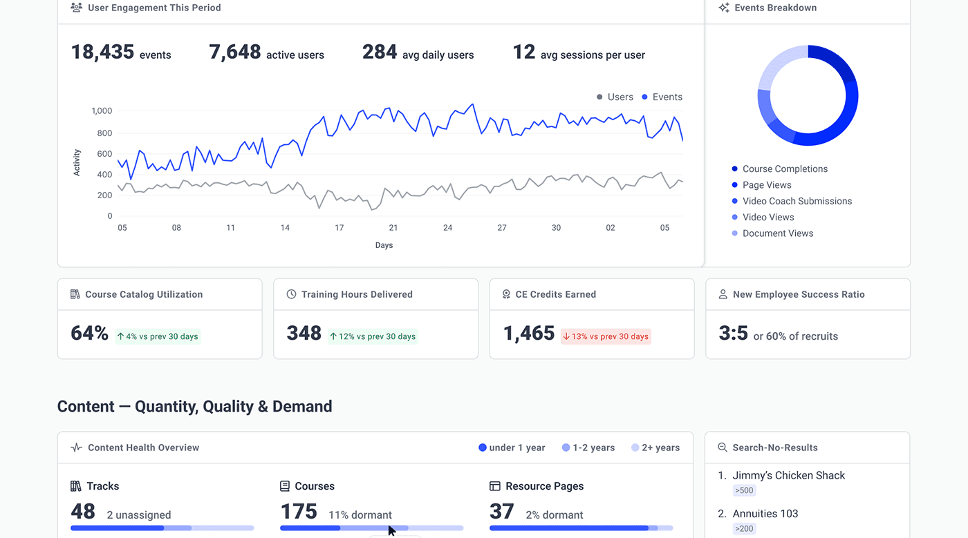
Pinpoint's LMS homepage had two distinct problems, and the obvious one was hiding the bigger strategic issue.
- The Obvious Bottleneck (Performance): The page rendered as a single large server response. Every panel had to compute sequentially before anything reached the browser. For data-heavy client homepages, users sat looking at a blank screen for over 15 seconds.
- The Strategic Dead End (Engagement): The homepage served a static, one-size-fits-all layout. Because we couldn't promote features based on what a specific client actually licensed, high-value investments like video libraries and coaching went entirely unnoticed. No two clients ran the same build, but every homepage looked the same.
The Audience
We were running a multi-tenant SaaS product serving three distinct user types the exact same static page:
- Learners (Advisors/Reps): Needed training status and upcoming compliance requirements at a glance.
- Managers: Needed downline visibility to see who was overdue, who was compliant, and who needed attention.
- Administrators: Needed to control what each group saw and configure the experience per organization, without filing an engineering ticket every time.
Reframing the Solution
The easiest path forward was to simply optimize the server render to fix the speed. But since we were touching the core code, I proposed a deeper fix: a dashboard built from independent widgets, each aware of client and individual context.
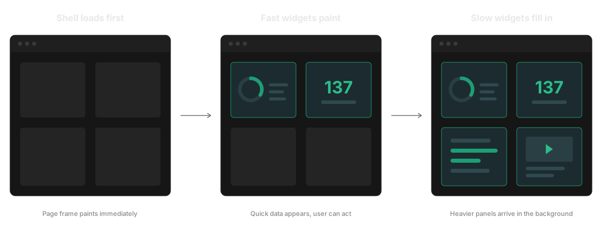
By tying context and performance together, a single decision solved both issues at once. If a widget is self-contained enough to know who it's for, it's self-contained enough to stream data independently. Fast widgets paint instantly while slower, data-heavy widgets fill in behind them.
To validate this shift, I pitched the dashboard concept at our annual user conference. Demonstrating how the layout would dynamically surface only licensed features generated massive client excitement and secured the internal momentum to move the project forward.
Key Architectural Decisions
- Context Drives Everything: Each widget knows who it is for. Client configuration controls which widgets appear, while role permissions and individual preferences narrow the view further.
- Optimize for Perceived Speed, Not Throughput: Instead of making users wait for the slowest panel, the UI pulls widget data in parallel. What people experience is time to useful content, not total load time.
- Fluid Layouts via CSS Grid: Rather than writing complex backend layout logic for every permutation of user roles and configurations, I designed the UI to rely on a CSS Grid system set to
densepacking. Widgets are assigned target column spans per breakpoint. If a widget is missing due to a client's disabled features or a user's permissions, the layout automatically collapses and fills the gap, ensuring a tight, unbroken interface. - Repeatable Patterns: Each widget operates as a self-contained unit sized for one developer to build end-to-end. A broken widget fails gracefully within its own panel without crashing the page.
- Passive Discoverability: By dynamically surfacing feature widgets, the homepage became the place where users discovered the platform was more than just a required-training checkpoint.
- Preserving Familiarity: To avoid alienating an established enterprise customer base, the new dashboard preserved existing page regions and content categories, eliminating a steep learning curve.
What shipped
I designed the end-to-end widget experiences and built the production CSS layer, ensuring it remained resilient across fluid layouts, variable loading states, and dozens of unique client brandings.
The initial widget set covered the real jobs of the homepage:
- Learners received training statuses and one-click "resume course" shortcuts.
- Managers received actionable downline analytics and review queues.
- Engagement features like media, events, and badges got their own dedicated surfaces.
- Administrators received self-service tools to configure each group's experience.
The Outcome
- Performance: Perceived load time dropped from over 15 seconds to just a couple of seconds before interactive, useful content appeared.
- Extensibility: Because the system was built around per-client and per-user variation from day one, future capabilities—like multilingual rendering, manager tooling, and end-user customization—fit in as simple configurations rather than massive redesigns.
- Scale: Widgets can now be swapped or installed live with no maintenance window. The framework is currently deployed across tens of enterprise client installations and remains the product's active core four years post-launch.
More work
Page Builder
B2B SaaS · Product Design
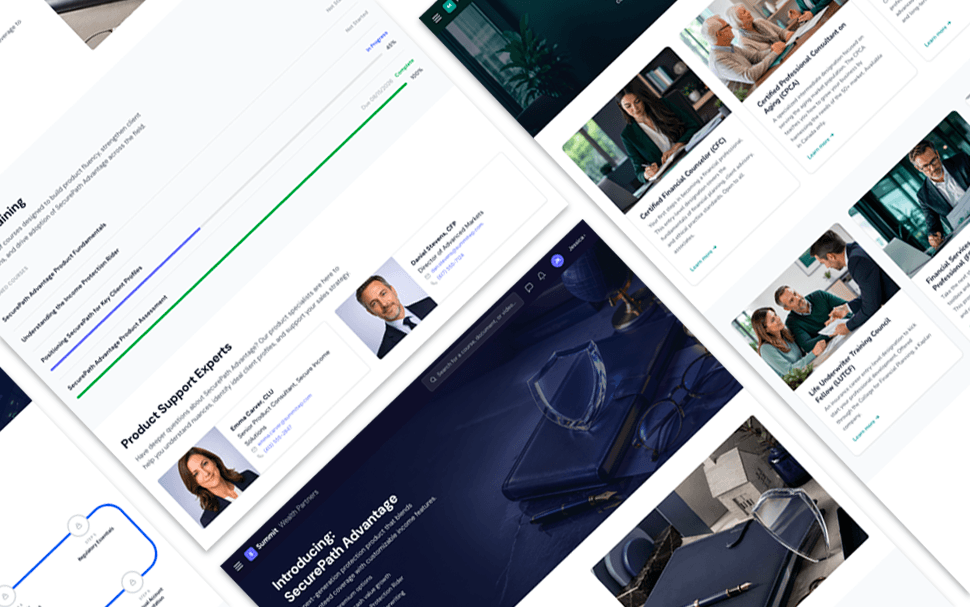
Every resource page cost an engineering ticket. Reframing templates as reusable sections removed the bottleneck and turned a one-off service into a product line clients kept buying into.
Advance
Independent · Product Design and Development
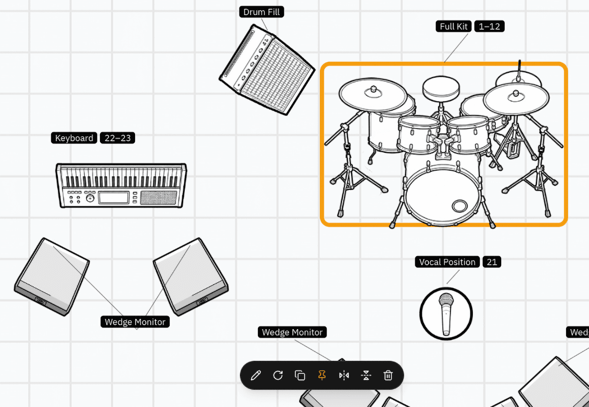
A production document platform for live touring crews, built from scratch. Stage plots, input lists, snake tables and other goodies for the logistic audio nerds that make the show happen. Private beta.